Spatial monitoring
Air quality mapping — spatial data, honest limits
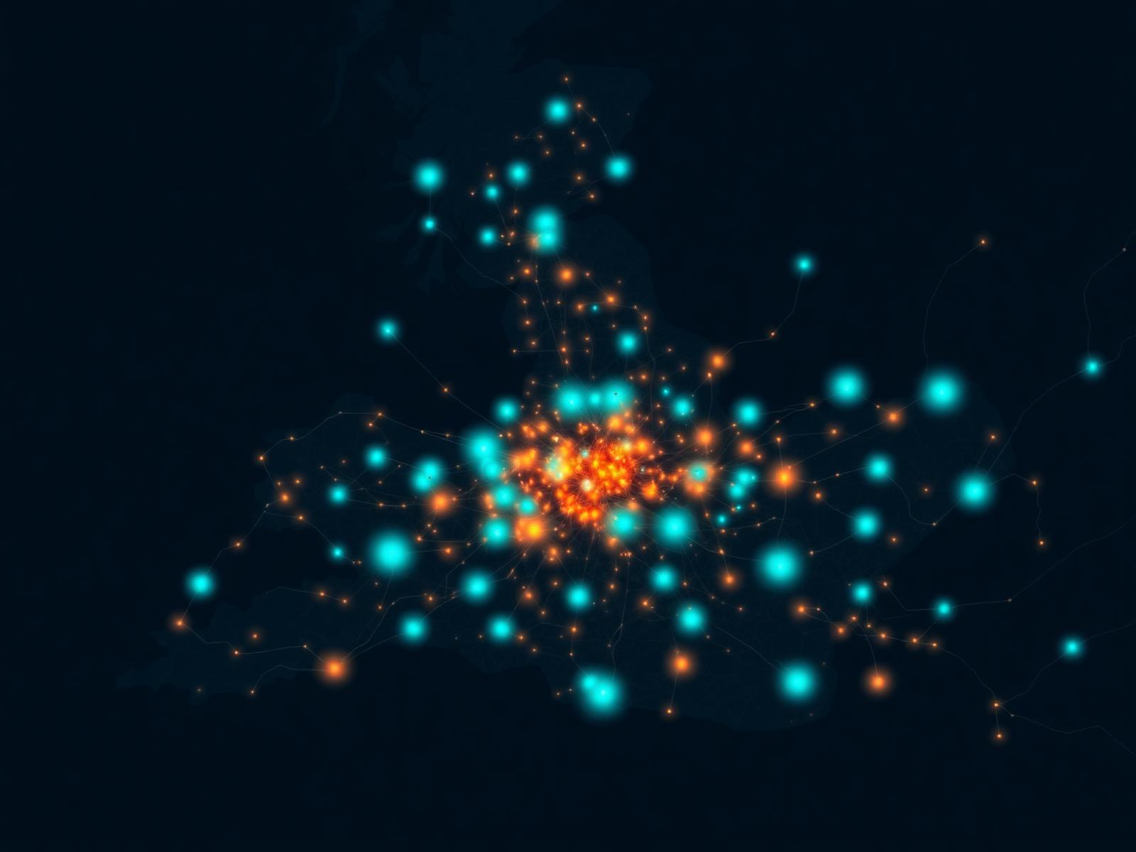
Maps make air quality intuitive. They also make it easy to overstate confidence in places no sensor actually reached. Useful mapping is explicit about where the data ends and the interpolation begins.
Approaches
The kinds of maps that actually exist
Fixed-network maps
Permanent sensor sites at known locations. Strong on temporal trends, limited by spatial density.
Mobile-survey maps
Vehicle, bicycle or pedestrian-mounted sensors mapping streets and routes. High spatial resolution, snapshot in time.
Hybrid measured + modelled
Sensor data combined with dispersion or land-use regression modelling for area-wide estimates.
Indoor building maps
Zone-level IAQ heat maps within a single building, overlaid on floor plans.
Method
From points to a continuous field
Every map is an interpolation between known points. Inverse-distance weighting, kriging and land-use regression each rest on assumptions about how the pollutant varies spatially — assumptions that hold better for some pollutants and geographies than others.
PM2.5 from regional episodes can interpolate reasonably across kilometres; NO₂ along a busy street can change by 50% over tens of metres. The same interpolation choice that works for one will mislead for the other. Map design should match pollutant behaviour, not a default template.
Honest cartography surfaces this. Confidence bands, sensor markers and an explanation of method belong on the map, not in a footnote.
Use cases
What air quality maps support
Public communication
Resident-facing dashboards that translate environmental data into action.
Estate prioritisation
Heat maps across a hospital, university or local-authority estate.
Episode response
Real-time spatial visualisation during high-pollution episodes.
Planning evidence
Site-specific air quality data for development assessments.
Limits
What mapping can hide
| Risk | What goes wrong | Mitigation |
|---|---|---|
| Sparse sensor density | Map smooths over hotspots that no sensor recorded | Show confidence bands and sensor locations |
| Uncalibrated sensors | Spatial gradients reflect sensor drift, not pollution | Co-location and quality flags |
| Wrong interpolation method | Pollutant variability doesn't match the assumption | Choose method to match pollutant behaviour |
| Time mismatch | Stale data presented as live | Display timestamp and data age prominently |
| Measured vs modelled confusion | Modelled estimates read as measurements | Visually distinguish on the map |
Suitable for
Who mapping serves well
Local authorities
Borough-wide spatial visibility for clean air zones, planning and community engagement.
Estate operators
Single-pane visibility across hospitals, campuses and commercial estates.
Environmental consultancies
Project-specific spatial data for assessments and reporting.
FAQ
Air quality mapping questions
Discuss an Air Quality Monitoring Project
Indoor and outdoor air quality mapping, AQI dashboards and spatial sensor networks for UK clients.
Request monitoring adviceOutdoor monitoring
Systems