Data visualisation
Air quality dashboards that earn the trust of operators
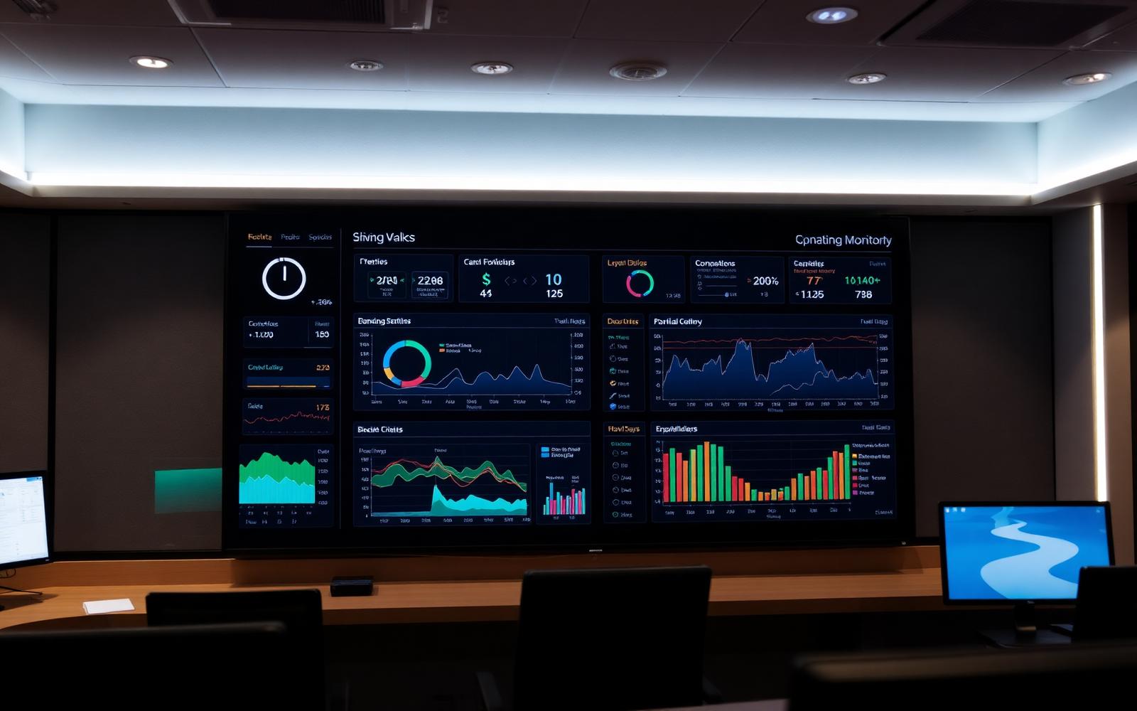
A dashboard is the most visible part of an air quality system — and often the most over-claimed. Good dashboards make trustworthy data legible, expose the limits of the underlying sensors, and turn observation into action.
Capabilities
What a working dashboard delivers
Live values
Per-zone readings refreshed at sensor interval, with traffic-light context against thresholds.
Historical trends
Configurable windows from minutes to years, with overlay across pollutants and zones.
Threshold alerts
Per-zone thresholds, escalation rules and routing to email or chat tools.
Multi-site comparison
Side-by-side performance across buildings to prioritise intervention.
Data integrity
A dashboard is only as good as the data behind it
The single most common dashboard failure is presenting data without context. A clean line on a chart hides whether the sensor has been calibrated this year, whether it is in the breathing zone or above a doorway, and whether the building was even occupied at the time.
Useful platforms expose calibration status, last reference comparison, sensor health and data flags alongside the value. Operators learn to trust dashboards that admit uncertainty far more than ones that claim none.
The aim is not visual polish — it is operational confidence. A dashboard that drives consistent, defensible action across a portfolio is doing its job, however quiet it looks.
Design principles
What good dashboards do — and don't
Show the question, not just the number
Each panel answers a defined operational question for a defined audience.
Surface uncertainty
Calibration date, sensor status and data quality flags are visible, not hidden in admin.
Anchor to action
Threshold breaches link to the response — a person, a ticket, a documented procedure.
Limits
What dashboards cannot do
Cannot improve bad data
Visualisation does not fix calibration, placement or sensor lifetime.
Cannot interpret causes
Specialist review is still required to diagnose why an environmental pattern exists.
Cannot replace ventilation engineering
Dashboards reveal symptoms; engineering changes resolve them.
FAQ
Air quality dashboard questions
Discuss an Air Quality Monitoring Project
Specifying, configuring and operating dashboards built on validated UK monitoring data.
Speak to a consultantData & analytics
By pollutant